

River Runners
CASE STUDY
The Problem:
River Runners has minimal and confusing navigation that makes it harder for users to understand where to go to order family-friendly meals.
The Solution:
Adding navigation to all levels of the hierarchy to allow users to find what they are looking for in a quick and easy manner.
My Role:
UX/UI designer
Team:
Julie Dinwoodie & Susan David
Tools:
Figma, Miro, QuickTime, Photoshop
Stakeholder interview:
We had a zoom meeting with Chandler, the founder of River Runners and he is aware of the limitations with the present site. It was created using a widget template by himself and he noted that it wasn’t as functional as he would have liked. Ideally he is looking to translate this into an app with a more user-friendly site.

Proto Persona
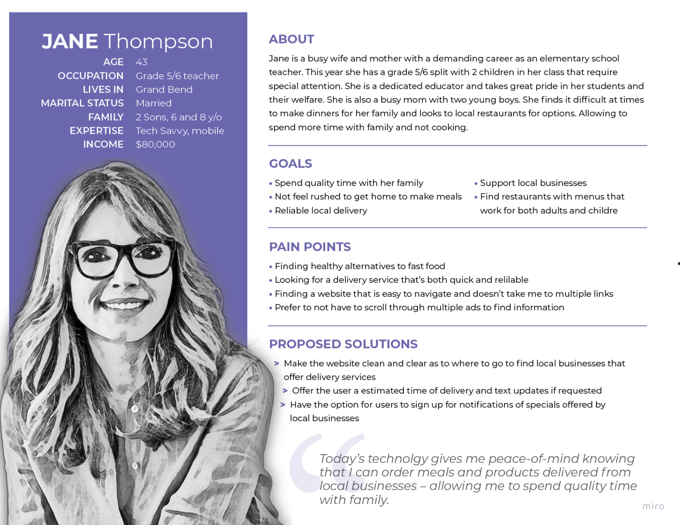
Julie and I first created our proto persona – Jane Thompson. Jane is a busy wife and mother with a demanding career in education. She has two boys that require special attention and this takes up much of her time. Jane is looking for local eats that will provide her family with an occasional meal so she can spend quality time with them.

Survey
We posted a survey on Meta containing 5 questions about restaurant delivery services – based on those results, 48% of people do not use a restaurant delivery service because it is simply not available to them. If given the opportunity to use a delivery service 60% would prefer to order from small local restaurants and 35% of those surveyed would use a service that specializes in smaller establishments.
Affinity Diagram
After conducting our user interviews we created an affinity diagram that helped us better understand our general users as a whole. We then prioritized our users’ feedback and specific pain points. Users found that the navigation font didn’t stand out, the website is too dark and they weren’t sure what the site was about or what they delivered. The data we gathered helped us prioritize the features we wanted to pack into our design.

Empathy Map
We then built an empathy map to get inside of the user’s head to understand what they are looking for in an online food delivery service. By gathering their pain points and gains we were able to use these to further focus our design.


User Persona
Now that we had a better understanding of our potential users, we created a user persona that solidified what we found in our research. Looking at the user’s preferences and known habits we were able to take that information into the next stage: Definition and Ideation.
User Insight Statement
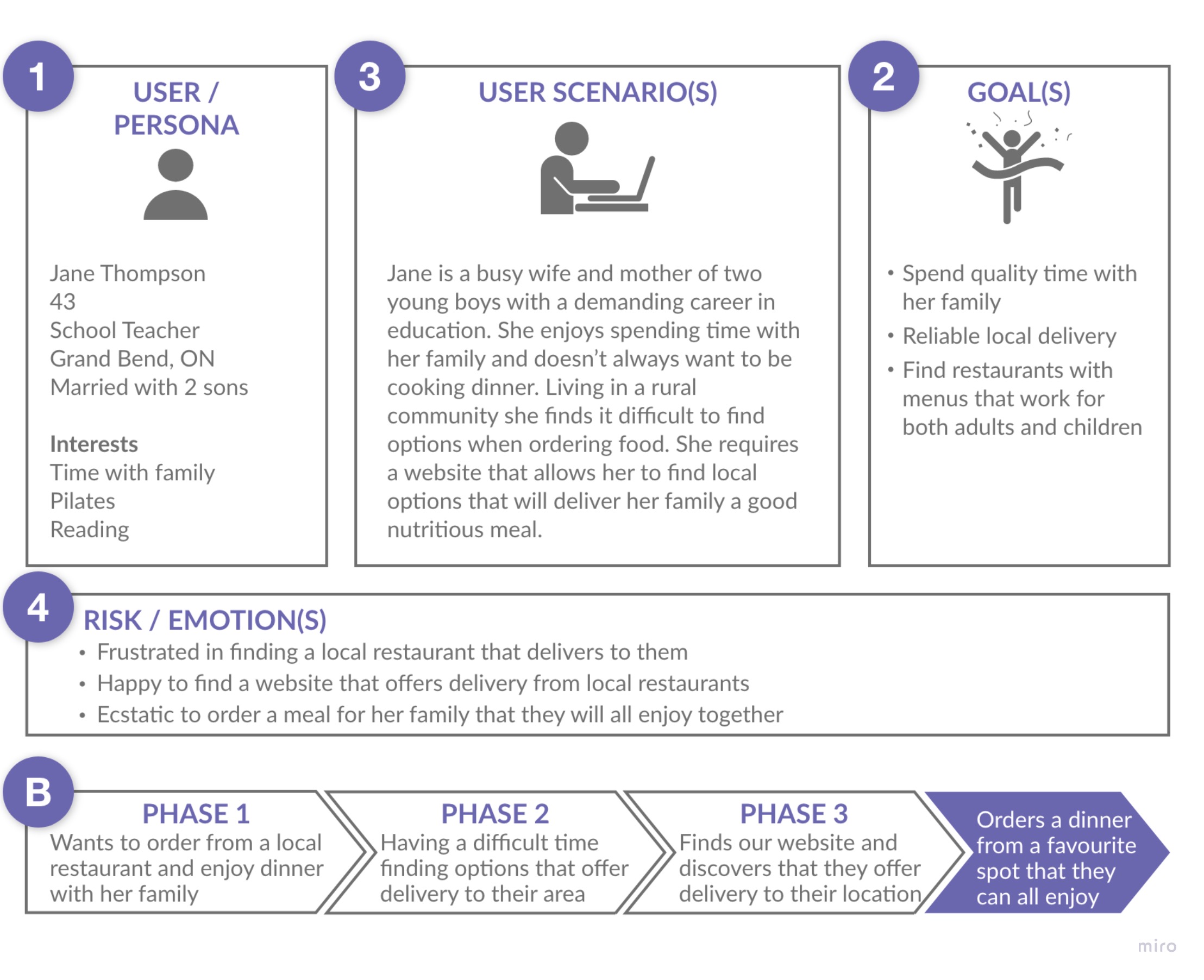
Jane is a busy wife and mother of two young boys with a demanding career in education. She enjoys spending time with her family and doesn’t always want to be cooking dinner. Living in a rural community she finds it difficult to find options for ordering food. She requires a website that allows her to find local options that will deliver her family a good nutritious meal.
Problem Statement
Available online platforms in the market were designed for consumers within a certain geographic area which provides them with many restaurant options and the main issue for our customers is location in rural areas. Based on our preliminary study we have observed these platforms do not provide customers in smaller communities with the option to order delivery from their local restaurants so they can feel less burdened by the pressures of cooking dinner for their family.
Users living in rural communities do not have access to the popular online delivery services that those in urban areas do.
Value Proposition
River Runners is online delivery service that focuses on those living in smaller communities by allowing users to order from local restaurants. They’re better because we offer a variety of local options to those that live in these communities.

Competitor Analysis
After defining our value proposition statement, we performed a competitor analysis to see what other similar companies exist. We chose the Skip The Dishes, Uber Eats and Feastify as direct competitors. For indirect competition we chose Speedee and We Got You Delivery. None of these competitors delivered to the areas that are featured on the website – Grand Bend, Exeter or St Marys.


Using our Problem Statement we began to ideate using the I Like, I Wish, What if method.
Feature Prioritization Map
We moved on to identify the most important problems to solve first using the feature prioritization matrix. This helped us to prioritize the features we wanted to use into our site.

Journey Map
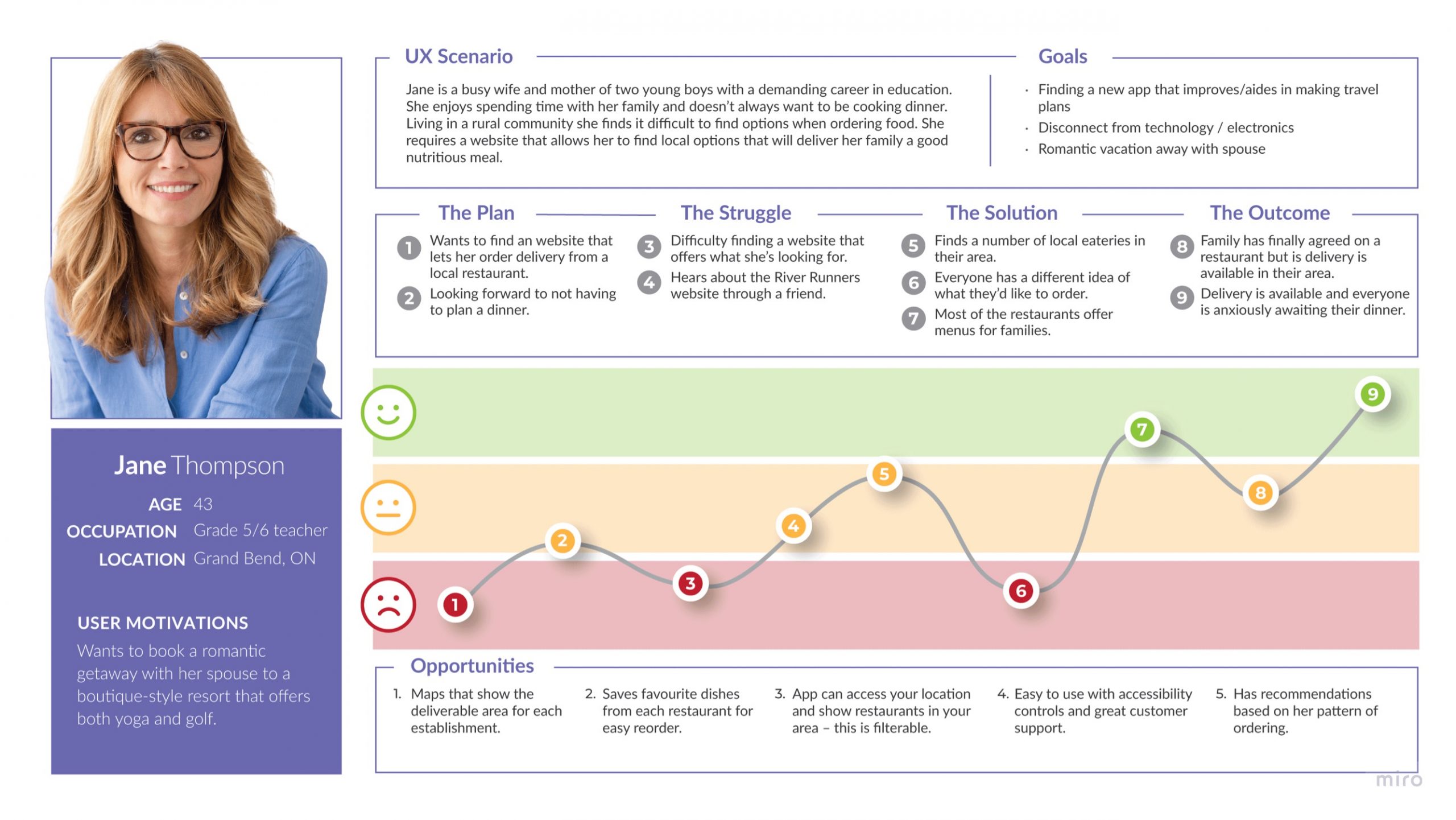
We generated a user journey map that took Jane, who was searching for a food delivery service that delivers in her area, through the River Runners website. By mapping out the needs and pain points of our user when interacting with River Runners we got a more in-depth look at what the website can do for users like Jane.
User Scenario
We created a User Scenario based on our User Persona, Problem Statement, Brainstorming notes, and the Feature Prioritization Matrix. Jane, our user, was looking to order dinner for her family from a local restaurant and needed to find a food delivery service that would deliver in her area. By using River Runners Jane easily found her city and ordered a meal for her family.
Card Sorting
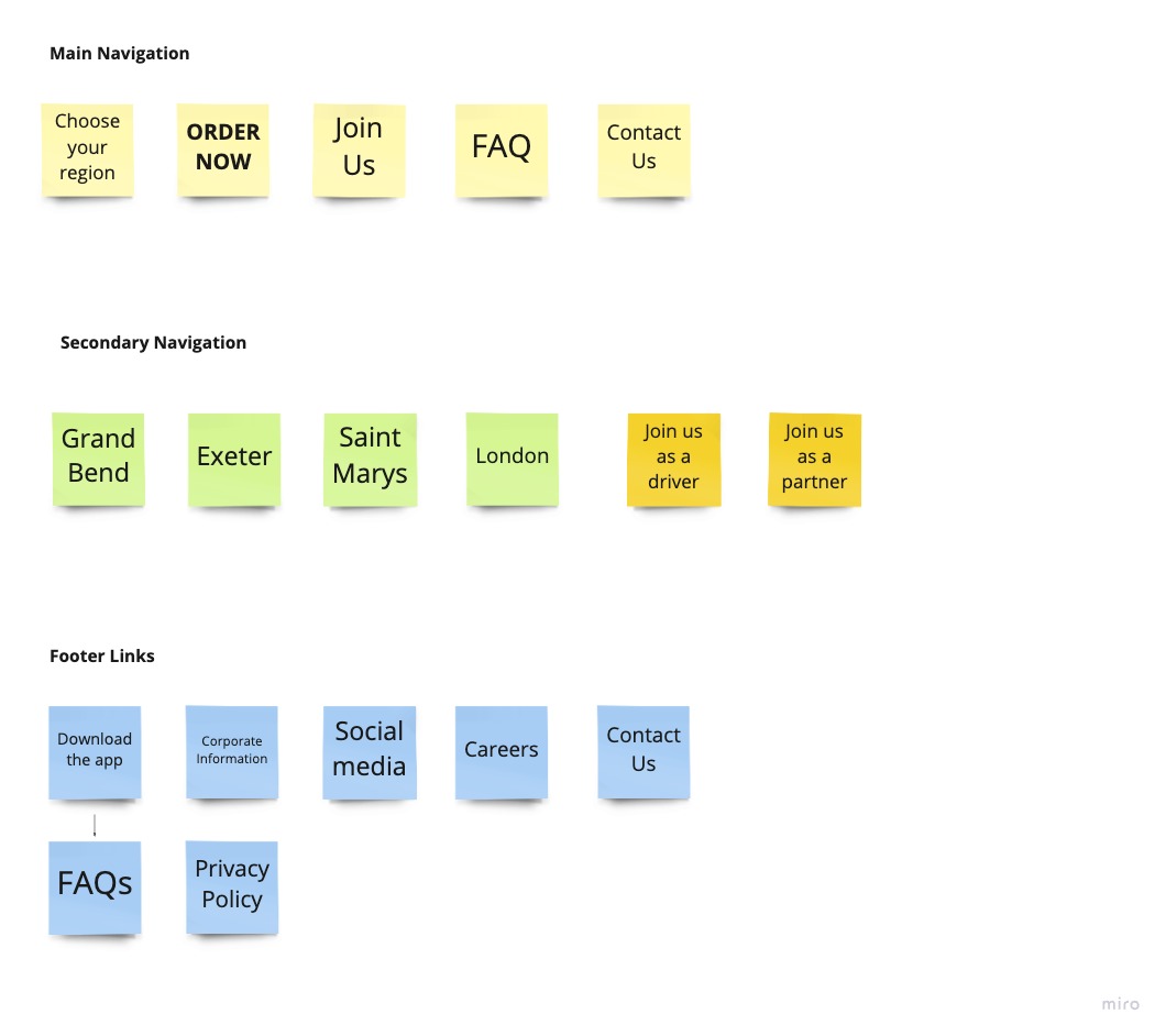
Julie and I gathered the current cards for the website to determine how to build our new navigation. We found that the majority of the links took us to external sites in order to see a menu and to order. We needed to look into pulling all this into the River Runners website to keep users there rather than sending them away.

New Cards
We re-sorted the current cards and created new cards for the locations, restaurants, menus and the checkout screens to keep the users in the website.
Site Map
From the card sorting we built out the site map. We double checked that we covered all the pages we needed to create in the website.

User Flow
For our user flow process, we considered the most important features and tasks that our users would go through, such as, finding their city, searching for a restaurant, adding to their shopping cart and checking out.

Wireframing
Leveraging from our user flow we sketched our wireframes to show the full process the user would take for food delivery.

Mood Board
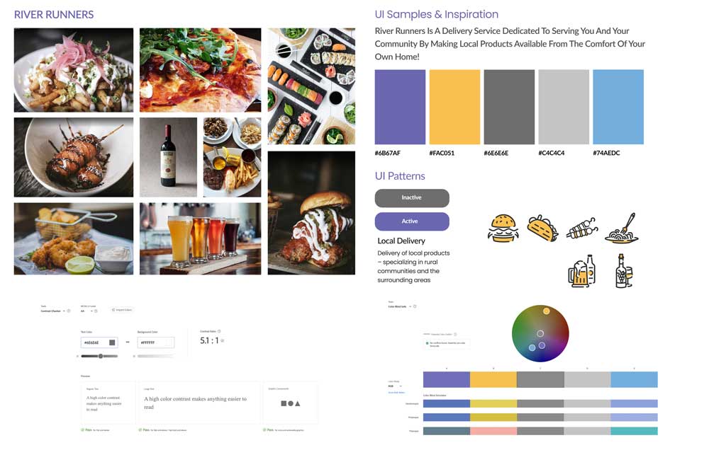
To find the look and feel of the revised website we pulled together some colours and images we felt worked with the existing logo colours. After checking contrast ratio and blind safe colours we landed on the colours you see here. We wanted to make our icons simple with a hint of colour to make them pop.
Style Guide
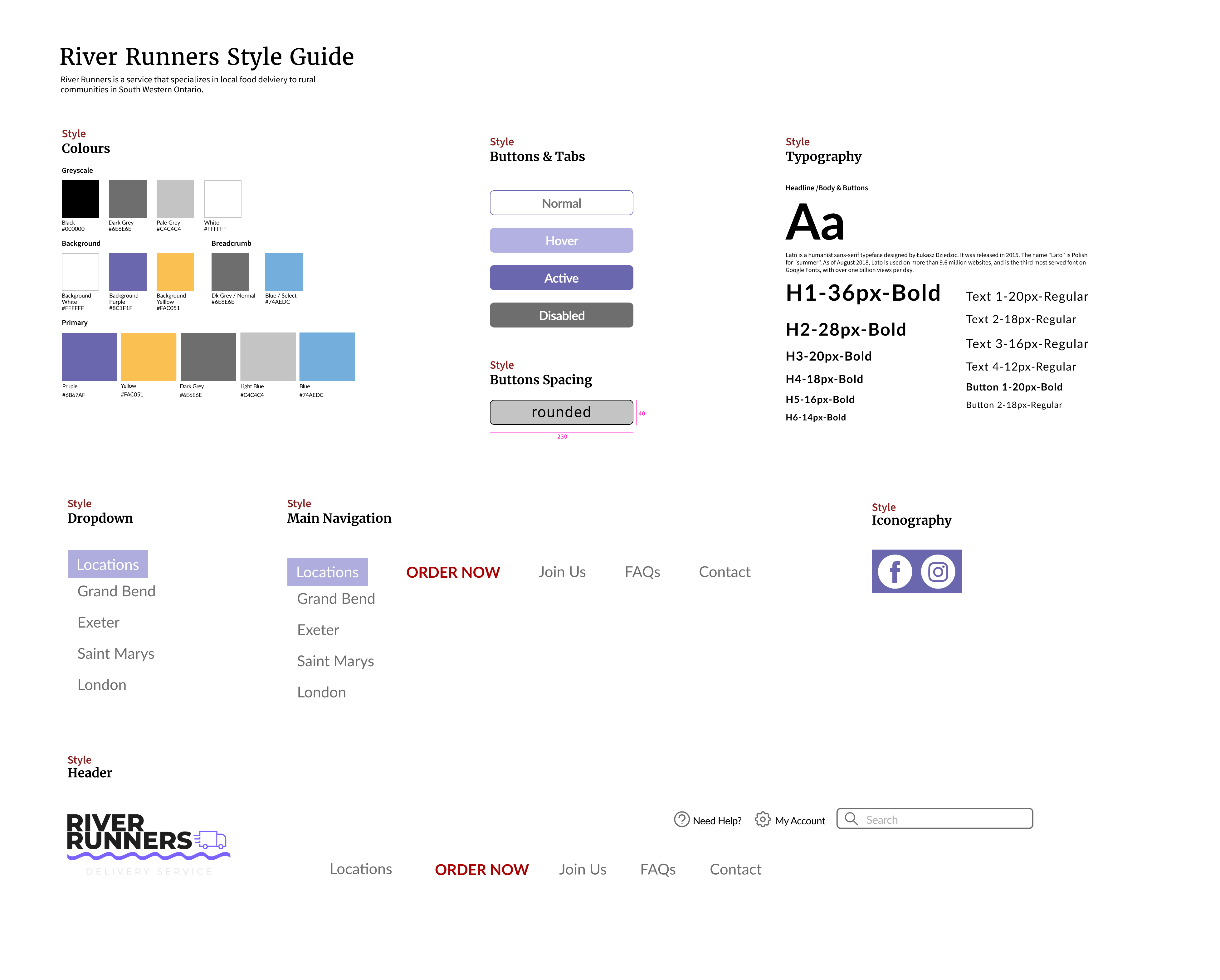
Working from the moodboard we created elements for the site to keep it simple, bright, and clean, as well, easy to navigate to find what you are looking for with far less clicks.
User Testing Results
We asked users to complete the same task as they previously did to see if they could use the new navigation more easily. Each of us tested two users and gathered the following results:
- Thought the map icons were links to the cities.
- Much easier to navigate than the previous site.
- User found the navigation to be clear and was able to easily find the page and complete the task.
- Very pleasing to the eyes – nice and airy.
- Love the simple design.
- In comparison to the previous River Runners website, users felt the navigation was simpler and more intuitive.
- New website is more professional and clean.
Some users did find some difficulty with the map hero image we created – thinking that the map icons were links.
A/B Testing
In our testing, we decided to get input from our users on our location dropdown and the map hero image. We found that users preferred the dropdown as it created a quicker experience for them. While the map was helpful, it continued to cause some confusion with users and their suggestion was to remove it entirely or have the icons link to the locations. In the end, we decided to remove the map from the page to create an easier experience for the user.

High Fidelity Prototype
As you can see the user can choose a location from the dropdown menu. From there they are taken to their city of choice and are able to see and select a restaurant they would like to order from. Choosing the restaurant takes them to the menu page where they are able to add items to their cart. Pressing the checkout button opens a page where they can review the items they have chosen as well as giving them the final total of their order. Selecting the Pay Now button opens a pop up to the checkout and then the payment successful page lets them know that the receipt has been emailed them to them and they will receive texts regarding their order .
Final Thoughts
The redesign the River Runners website was a project that allowed us to explore the exciting possibilities that a UX/UI designer would experience. Throughout this process, we learned a valuable lesson: Keep It Simple!
In the original site key elements required editing, specifically the main navigation, an essential part to the user experience. We broke down the links on their web pages and by card sorting we were able to develop a navigation bar to help those visiting the site find the key categories that they would need.
We dropped the dark colour scheme for a white, bright clean design. We removed all the external links and brought the experience back to the River Runners website. Users can now view and order from each restaurant’s menu without having to leave the website.
Through our iterations we found that simplifying the user process was the key to making this website easy to navigate and quick to order from.
