
Canadian Food Inspection Agency
Brief
The CFIA has non-existent main page navigation that makes it harder for users to understand where to go on the website to get the information they need.
THE SOLUTION:
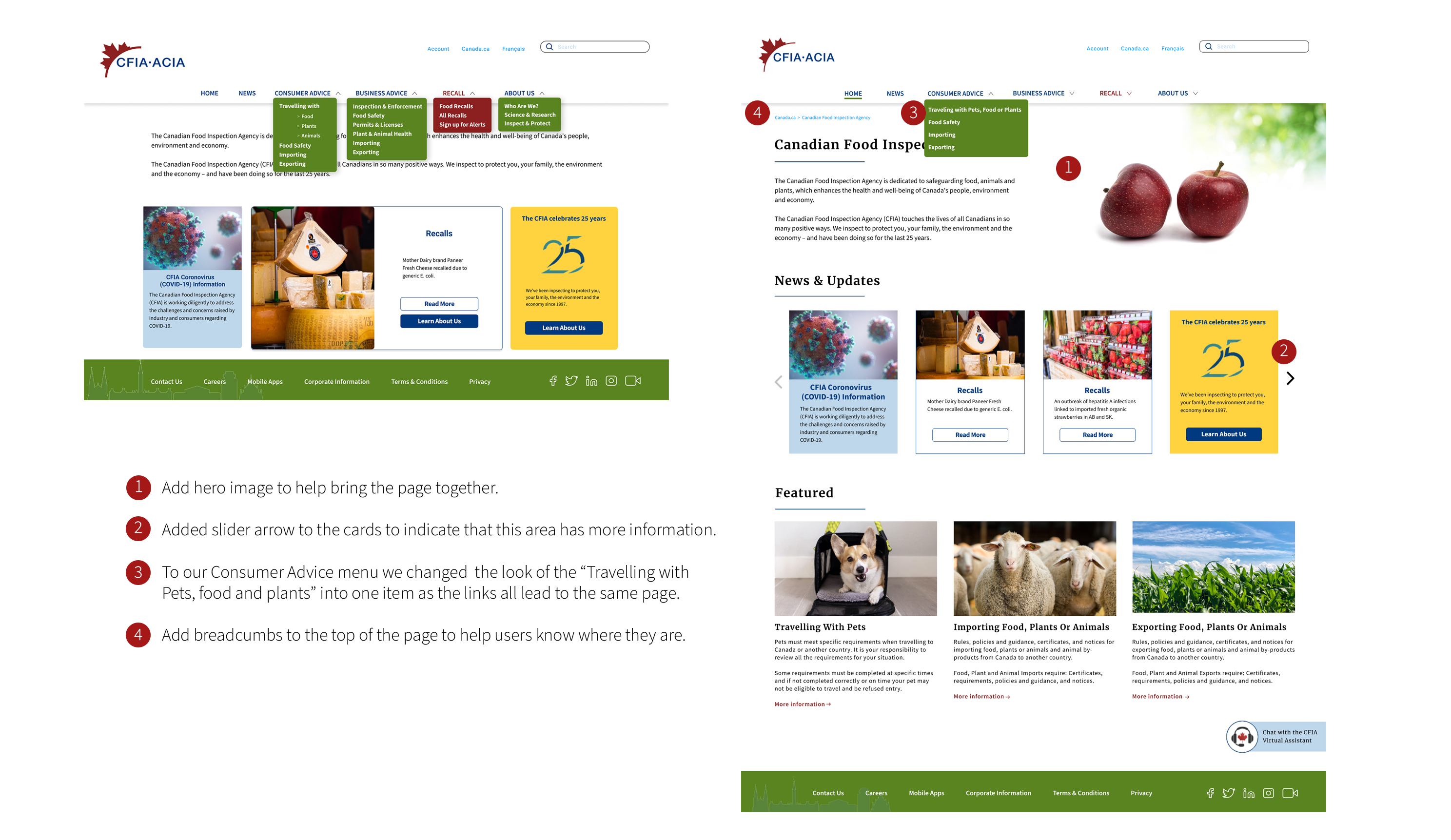
Adding navigation to all levels of the hierarchy to allow users to find what they are looking for in a quick and easy manner.
MY ROLE: UI designer
TEAM: Julie Dinwoodie, Stefani Adams, Monique Mendoza, Olena Voroniuk
TOOLS: Figma, QuickTime, Photoshop
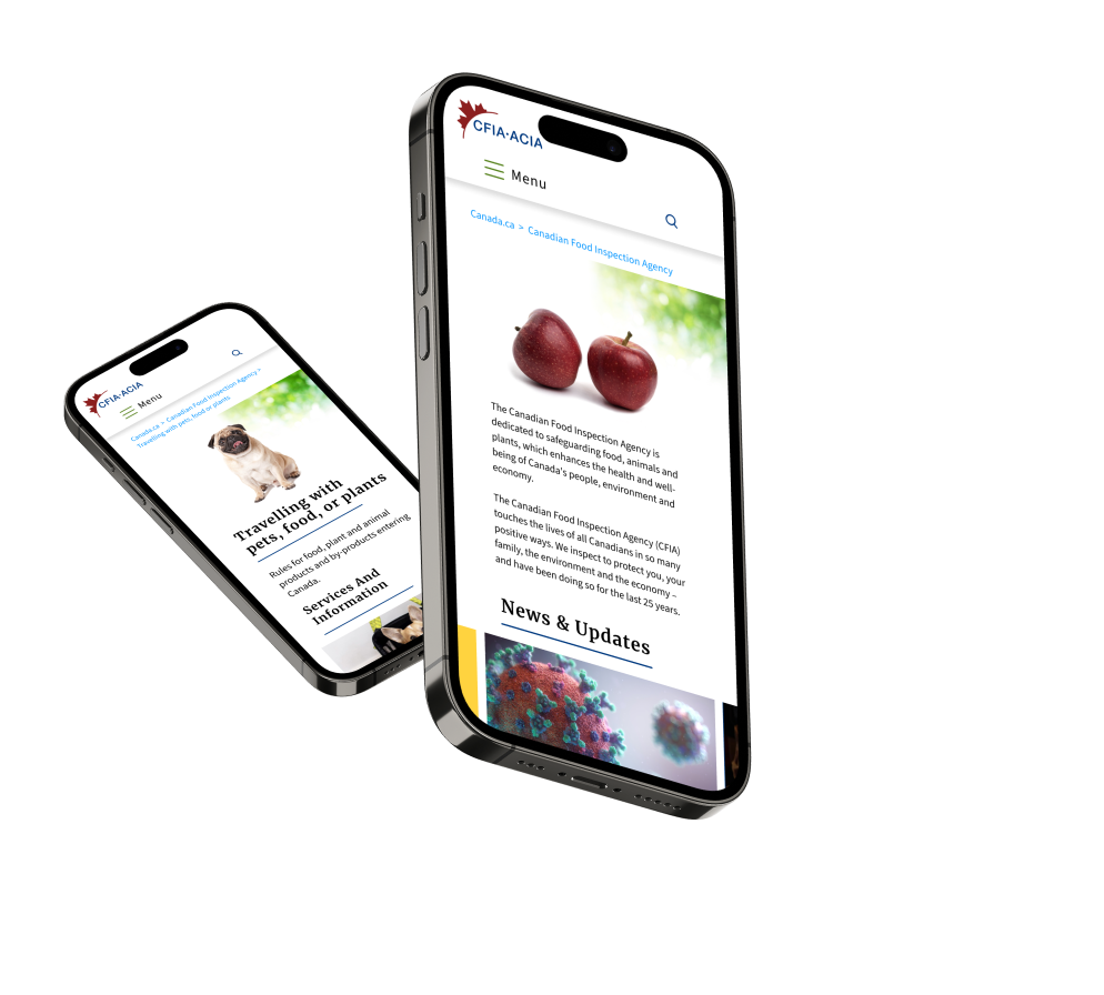
The Canada Food Inspection Agency allows consumers and business to find information on recalls, importing & exporting food, plants or animals and food safety. In our assessment of the website, users found it confusing to find the information they were looking for and they got frustrated easily and sometimes gave up entirely. With no visible navigation and links scattered around the page with no sense of direction we decided to create a more easy-to-navigate homepage and extend the new design to mobile.
Main Task
Applying to bring a dog from a foreign country into Canada through the CFIA website.
Research Questions
What, if any, pain points or roadblocks did you find when trying to complete your task? Please elaborate.
What does the user like about the website?
Is there anything in the process that you didn’t understand?
Is there anything that you would change to make your task simpler?
Comment on the look and feel of the website.
Iterations from Testing
From our user tests we set to work on making some of the suggested changes to the website.

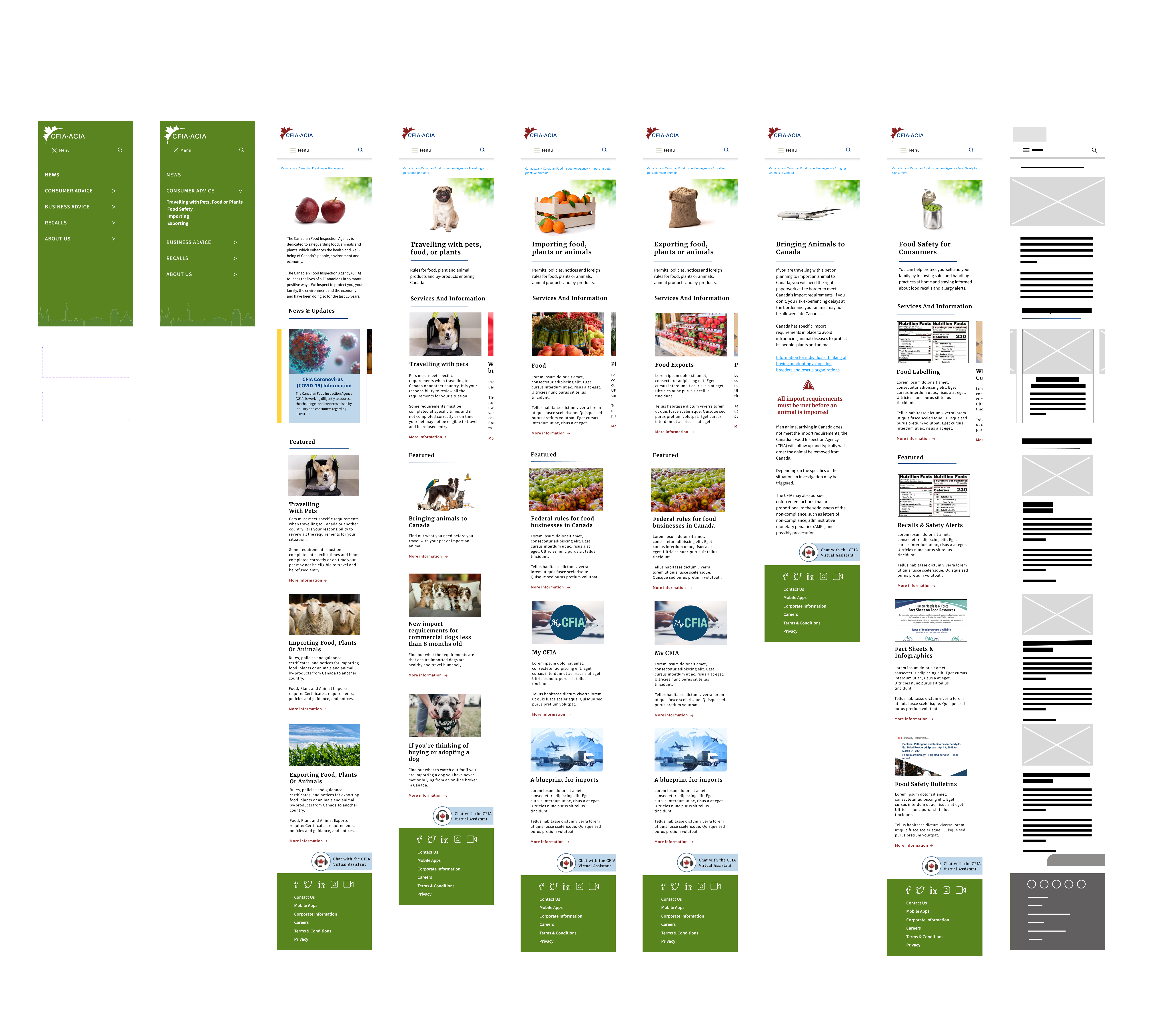
After iterating we extended our design to the other pages inside the Consumer Advice dropdown before moving to create a mobile version of the webpages.
Desktop Pages

Mobile Pages

Website Walkthrough
Final Thoughts
The redesign the CFIA website was a project that allowed us to explore the exciting possibilities that a UX/UI designer would experience. Throughout this process, we learned our first valuable lesson: Keep It Simple!
The original site was missing key elements, like main navigation, that was essential for users. We broke down the links on the main page to use for card sorting and were able to develop a navigation bar to help those visiting the site find the key categories that they would need within the CFIA site.
We made each page consistent with a scrolling New & Updates section as well as Features cards for the most requested links for that section of the site, providing more information on the cards for the user.
Through our iterations we found that by not adding too many graphic elements to an already busy site kept to our original goal of keeping it simple.
CFIA Full Case Study

